Skillz / Rebrand
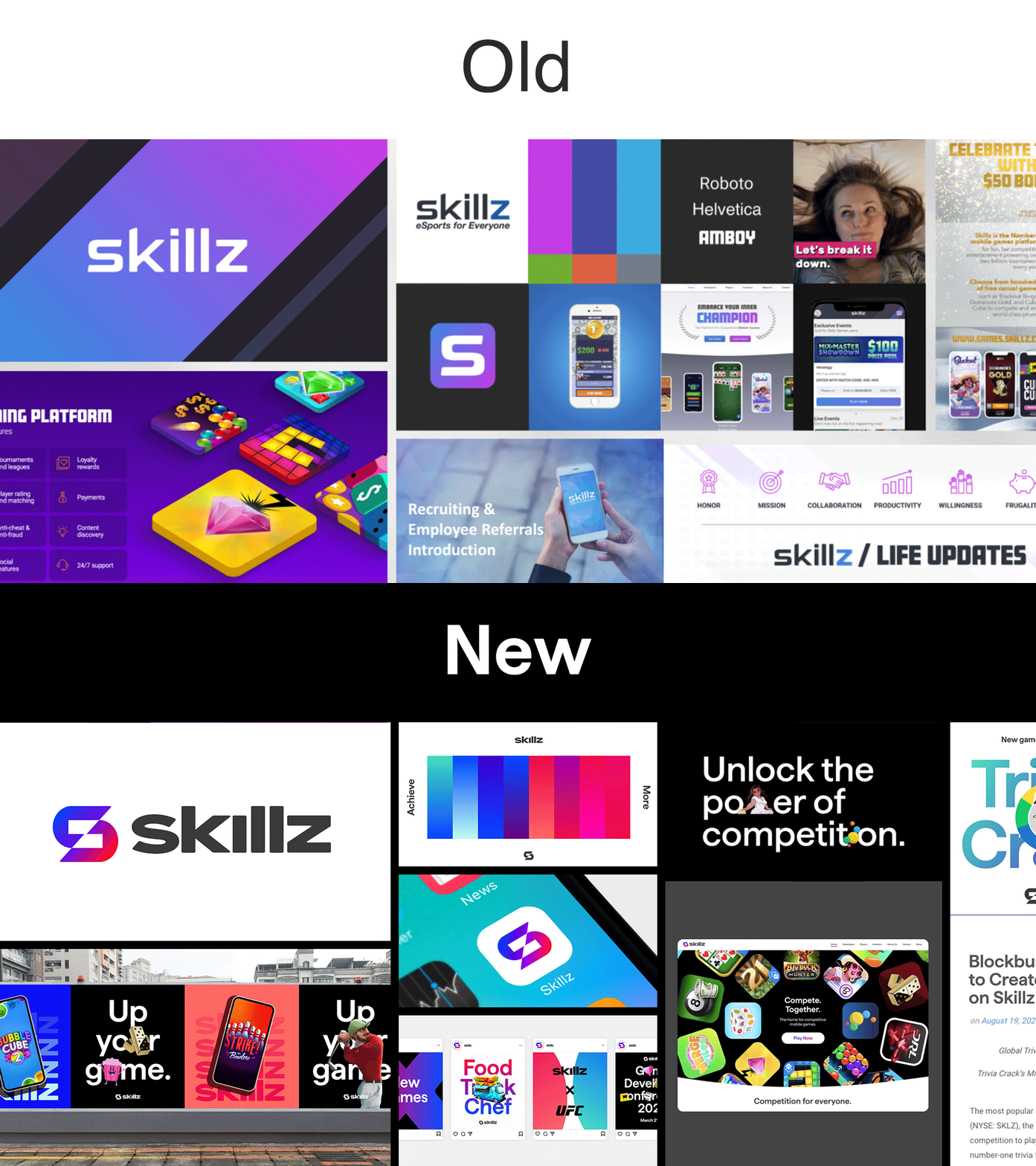
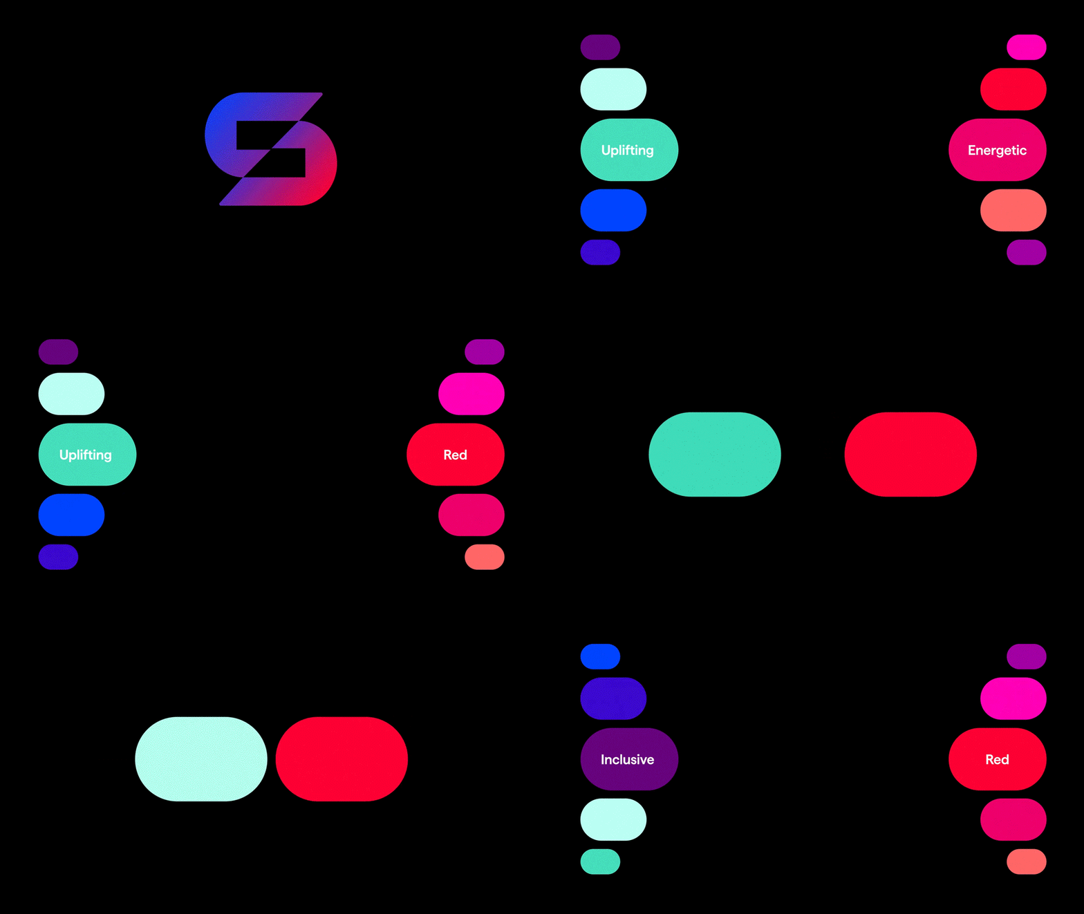
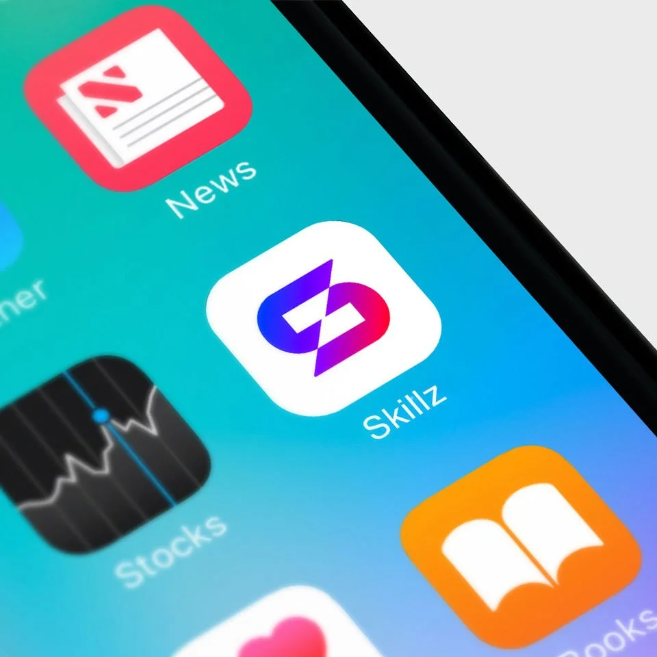
In any Skillz game, you go head-to-head with one real-life player who matches your skill level. Competing with real people shows you what’s possible and brings out your best. The new Skillz mark builds on that, with two balanced sides coming together to compete and push each other to new heights. Their core colors are red and blue, a common head-to-head trope dating back to the beginning of gaming (video or otherwise). When they combine, they create a new color in the center. We round it out with a custom wordmark that feels safer and more welcoming than the previous logo, with extended letterforms for a “competitive” stance.
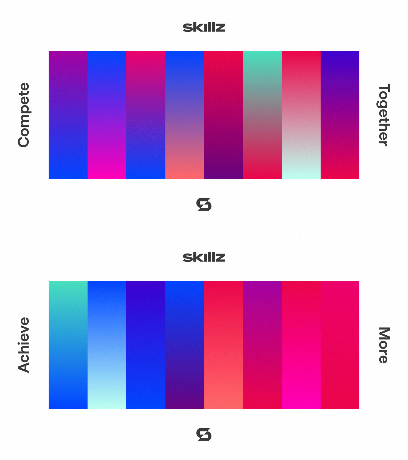
The core red and blue colors extend to form a “red team” and a “blue team”. One color from each team combines to create two sets of head-to-head gradients: one “compete together” set (colors from opposing teams) and one “achieve more” set (colors from the same team). Each combination retains either the core red or blue for consistency.
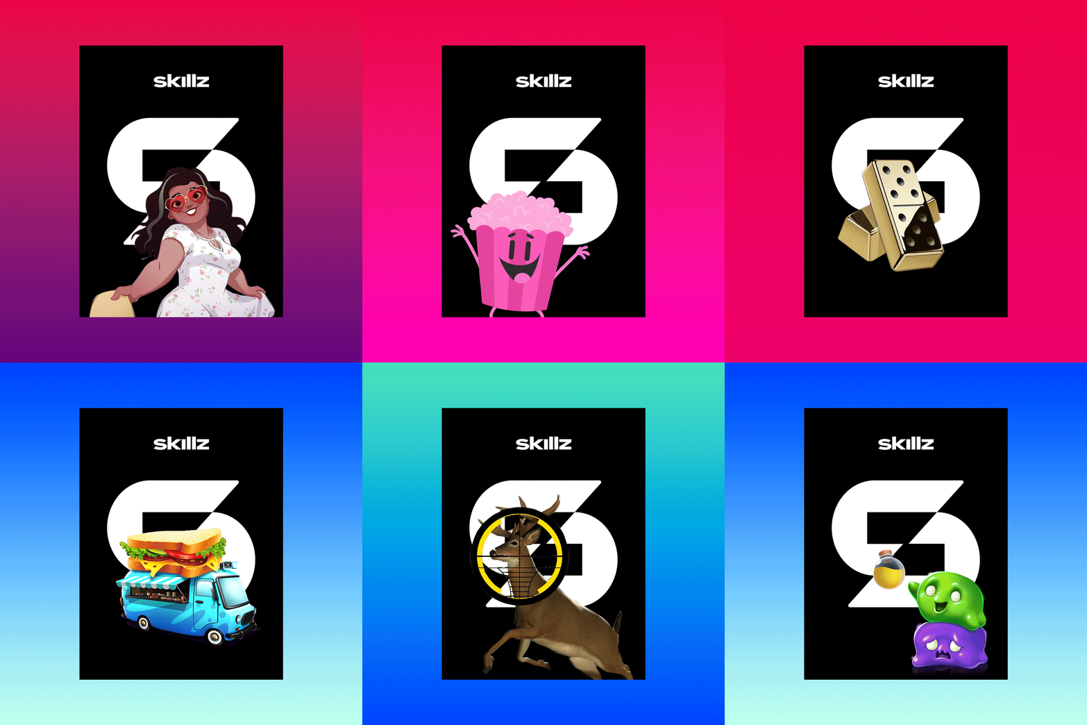
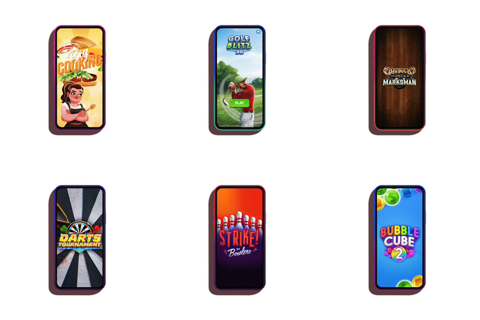
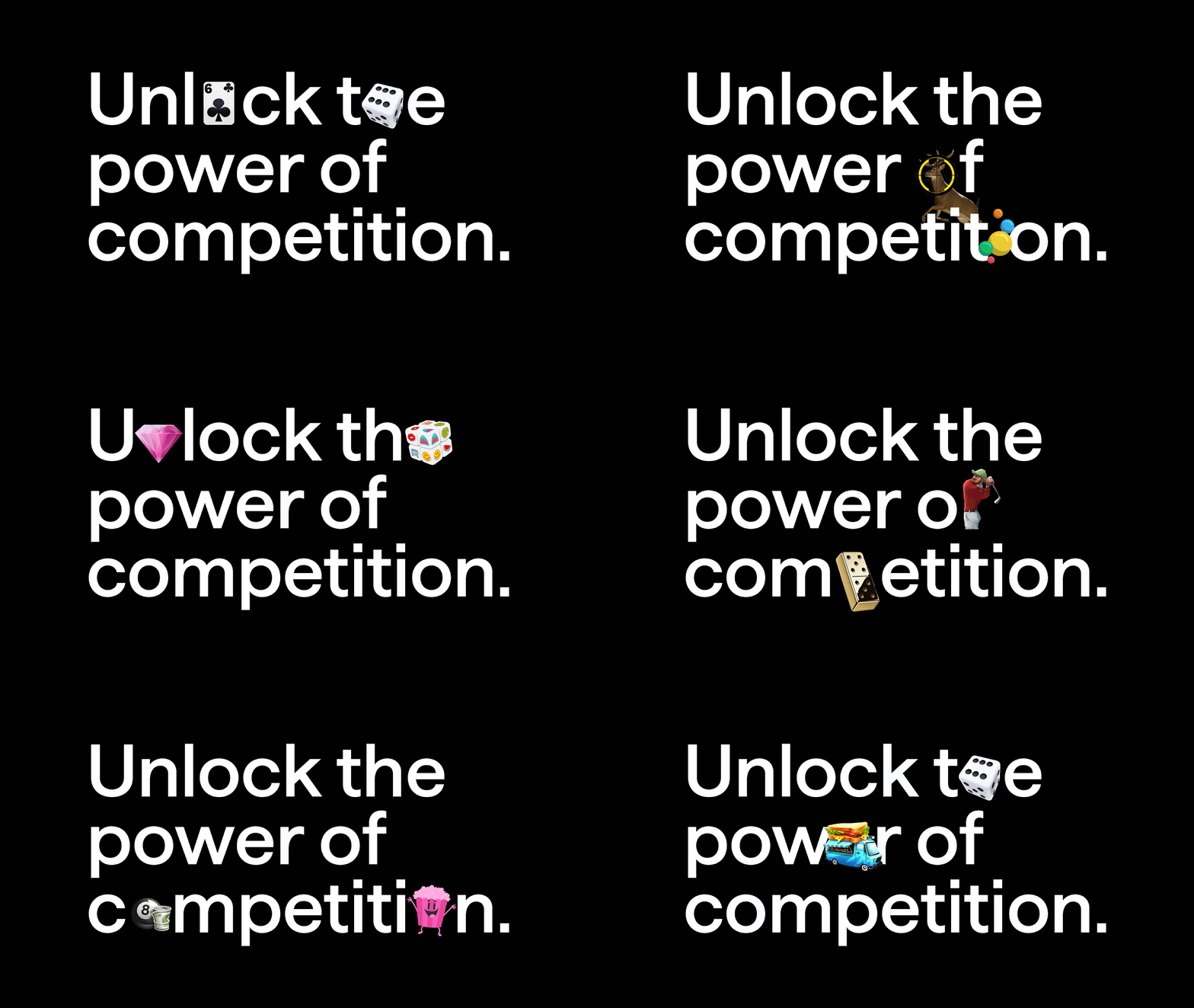
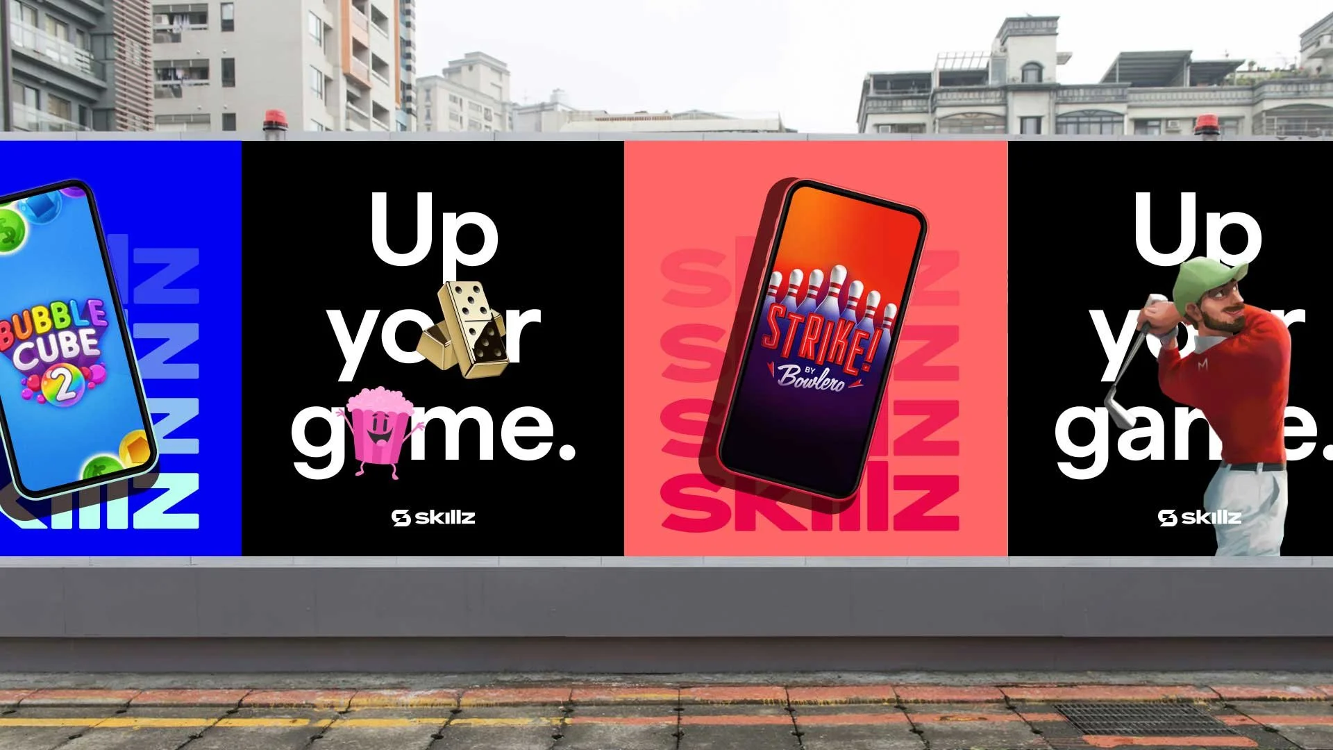
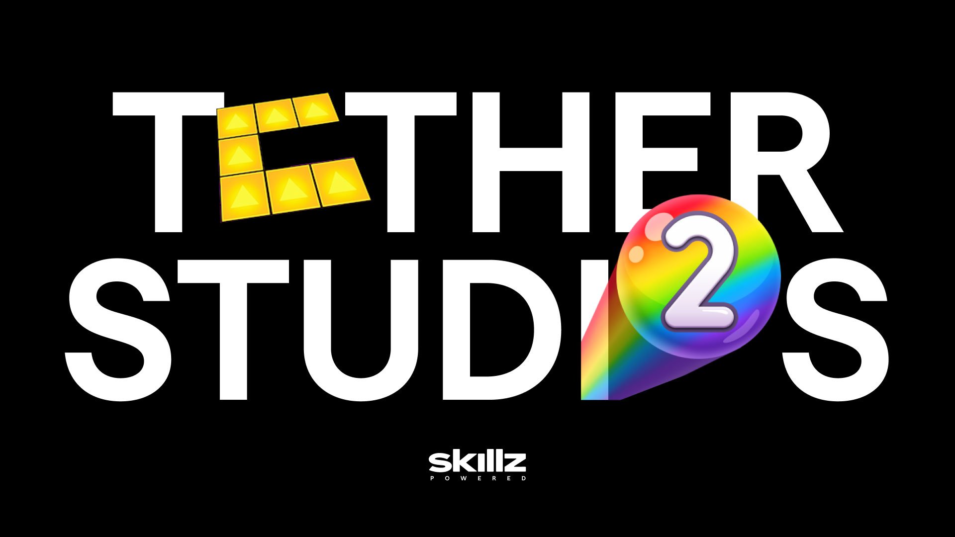
We shine a spotlight on Skillz games through a playful combination of app icons, game elements and “game-mojis”. This helps capture the breadth of the Skillz universe and make competition accessible (and fun) for everyone.
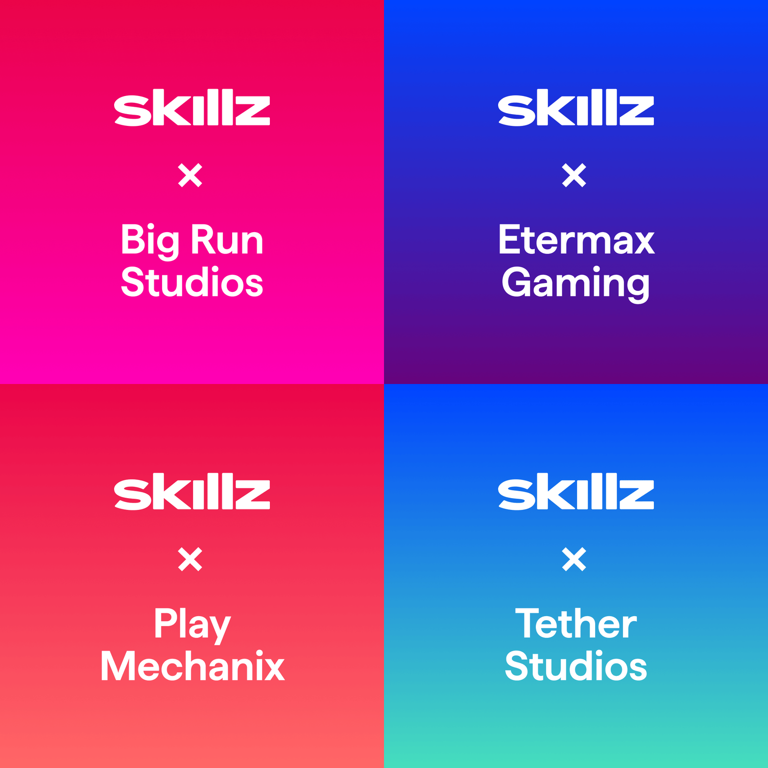
Empowering independent developers is a huge part of the Skillz model. We extended key identity elements for instances where we are highlighting our partnerships with gaming studios.
Details of the Skillz mark were deconstructed to create a set of animated super graphics that add energy and interest to messages and announcements. Graphics are grouped into four categories: Competition, Achievement, Community and Partnerships.

